
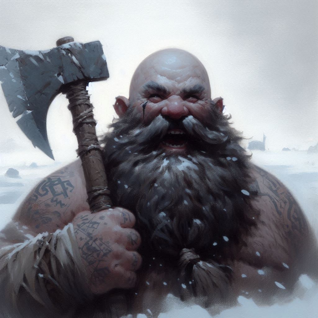
When it comes to portraits for CRPGs style consistency is very important to me. Games like Icewind Dale or Deadfire have very strong aesthetics, and I like to generate portraits for my characters which both match each other and vibe well with the atmosphere of the game. My most recent interests have been in Icewind Dale and Icewind Dale 2, so I spent a lot of time getting a look I liked for those games – inspired by the work of Justin Sweet in Icewind Dale 2. So the majority of my portraits tend to look like the happy fellow on the right, using style prompts of:
“dark fantasy, rpg portrait by justin sweet, soft focus, blurred, minimalist features, oil paint, drawing, in the snow, d&d, dark shading”
For a game like Deadfire, however there’s more of a watercolor on parchment vibe. So I go with a style like this:
“sailing at sea, watercolor style, drawing”
That produced Francesca, the pirate captain rogue due to set sail next time I fire up a Deadfire run:

For a game like Temple of Elemental Evil, the in game portraits are tiny – and tend to be more “cartoony”. Both stylistically and to come out clearly with a very small number of pixels. So for those I tend to use style prompts like “comic style, minimalist, high contrast, bold colors” That produces a rendering of Grimslade – for example – like this.

You’ll see many different styles in my portraits on other pages, as I often experiment to see how my characters look in different formats.
Leave a Reply